
MSBD 5005 Visual Design
Here we are going to show the Visual Design of our MSBD 5005. The group members are: Wei FAN, Minghao WANG, Yifan ZUO, and Yiyun ZHONG.
We focus on the 3rd question about VAST Challenge 2022. Here are our Answers.
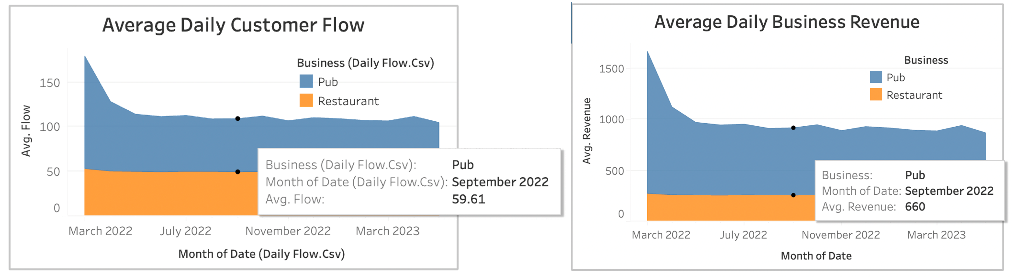
- Question 1. Which businesses appear to be more prosperous? Which Businesses appear to be struggling?
Answer:
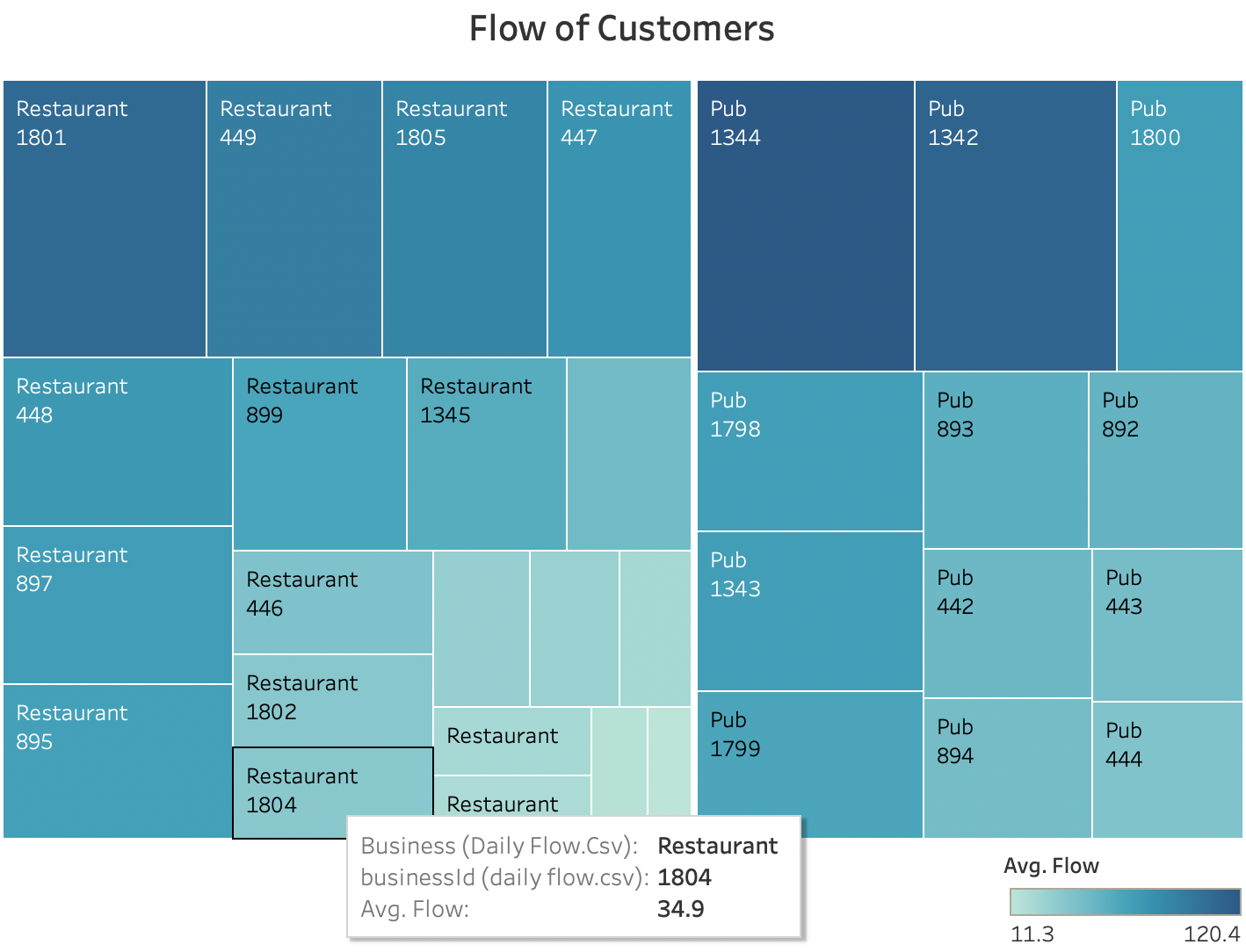
- Question 2. Who gets the largest slice of the pie? Is the distribution similar for pubs and restaurants?
Answer:
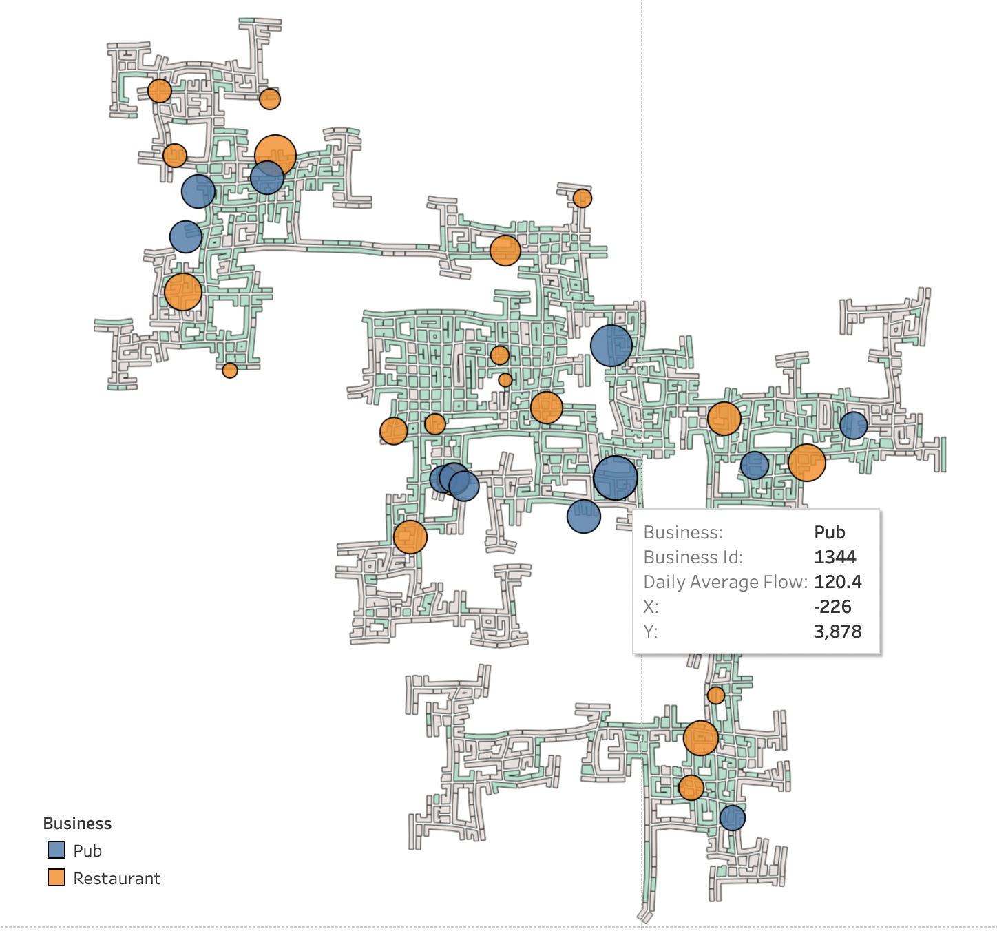
- Question 3. Is there clustering of one type of business? Does location matter for pubs and restaurants?
Answer:
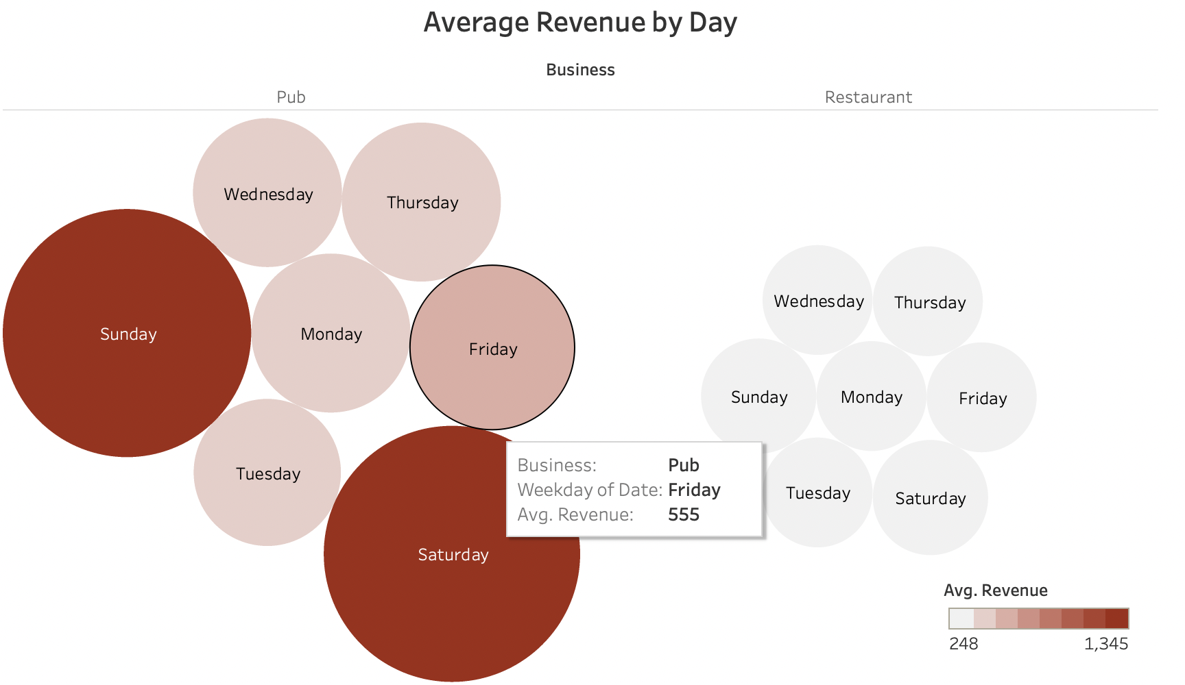
- Question 4. Do pubs and restaurants have similar revenue patterns? Which business is more volatile?
Answer:
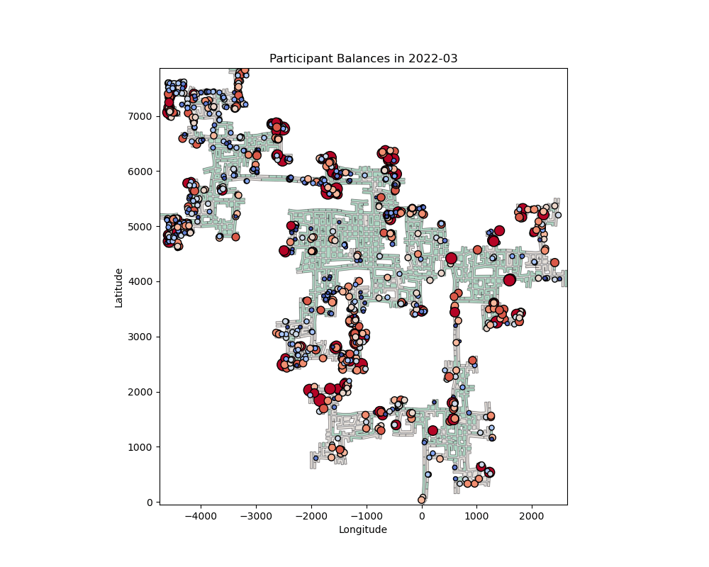
- Question 5. How does the financial health of the residents change over the period covered by the dataset?
Answer:
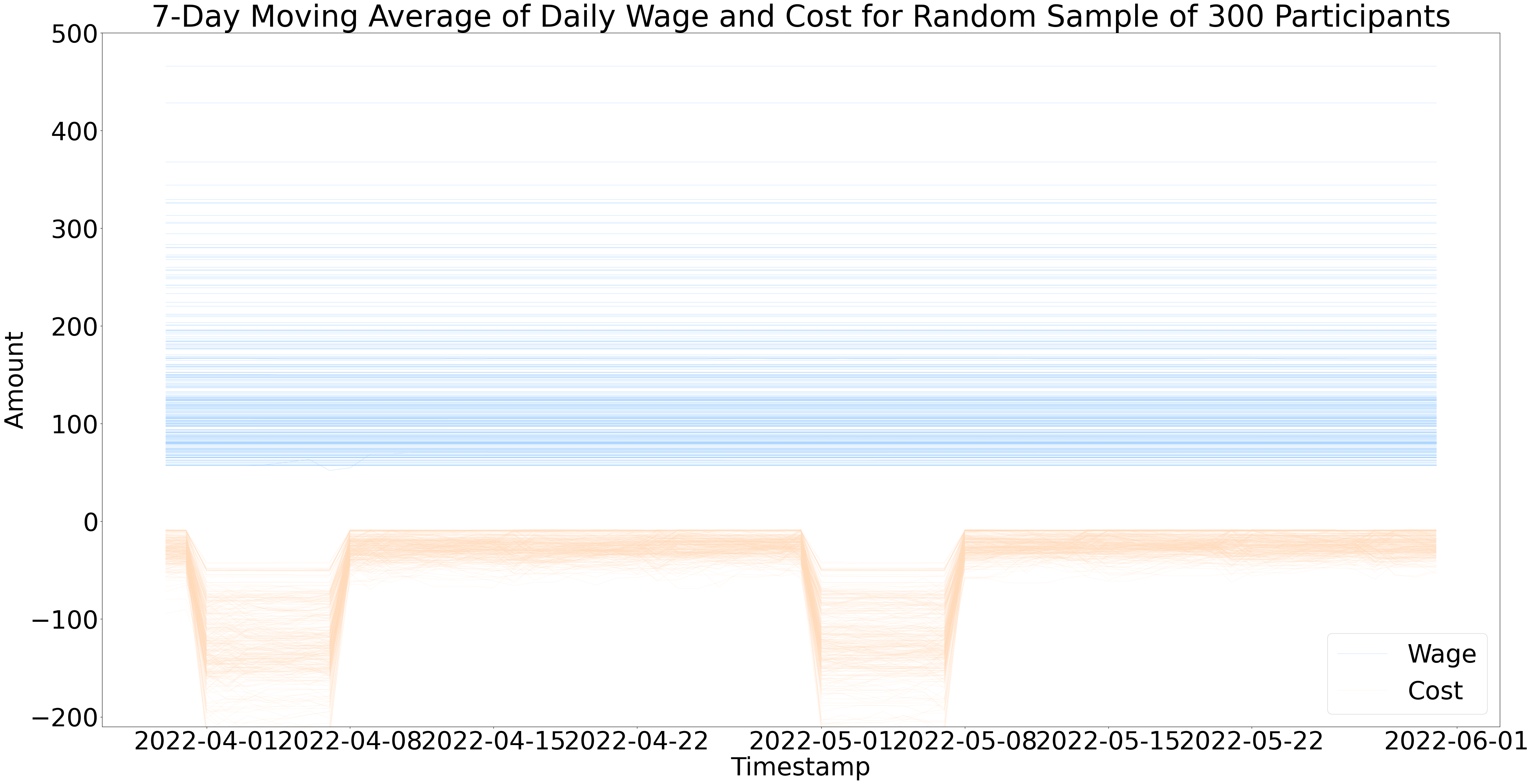
- Question 6. How do wages compare to the overall cost of living in Engagement?
Answer:
- Question 7. Are there groups that appear to exhibit similar patterns?
Answer:
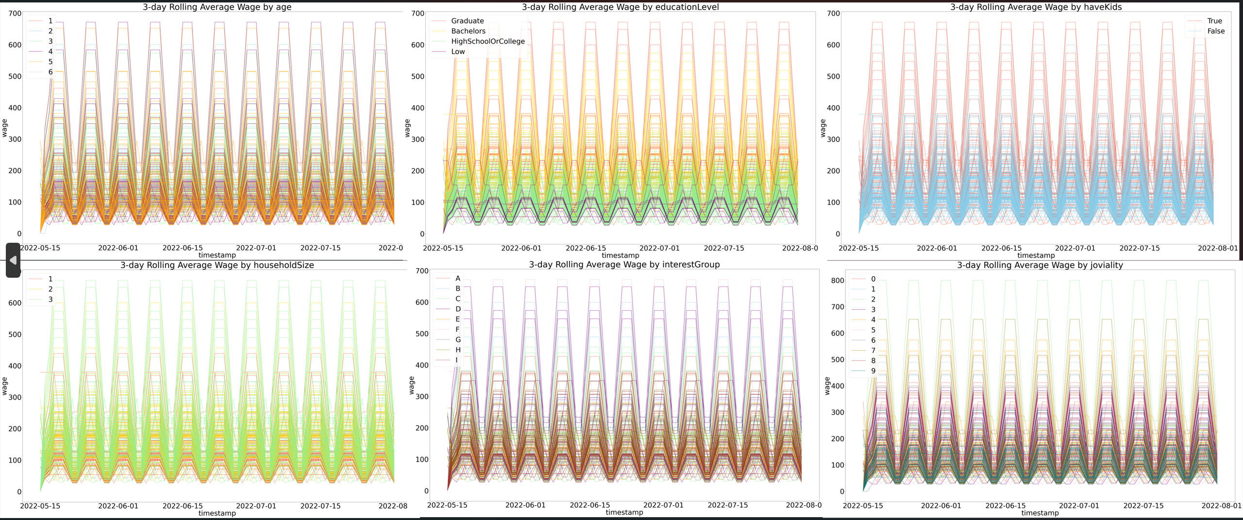
The above is about the wage.
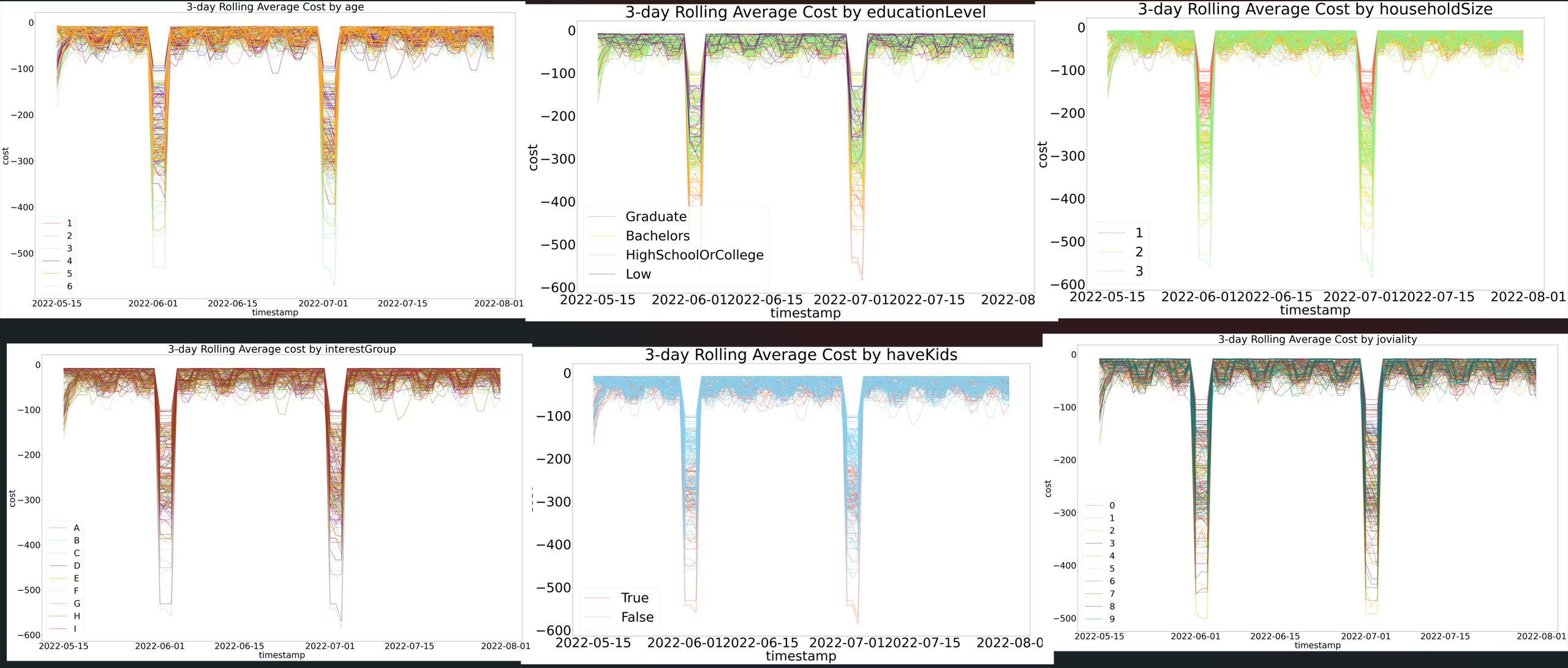
The above is about the cost.
- Question 8. Describe the health of the various employers within the city limits. What employment patterns do you observe?
Answer:
Here is the scatter plot showing the monthly rate for each employer. We use double encoding to show this trend.The color shows the details about education requirement, and the size shows monthly rate. In this scatter plot, the x axis shows the employer ID and the y axis shows the monthly rate. We can see that the orange color, which represents those work with a minimum requirement of graduated students, has the most monthly rate. And the smallest circles are the blue one, which represents that of high school or college.
Besides, we also use a stacked scatter plot to find the employer with the highest monthly rate. They are the biggest and reddest circles. The number in the circle is their corresponding ID.
- Question 9. Do you notice any areas of particularly high or low turnover?
Answer:
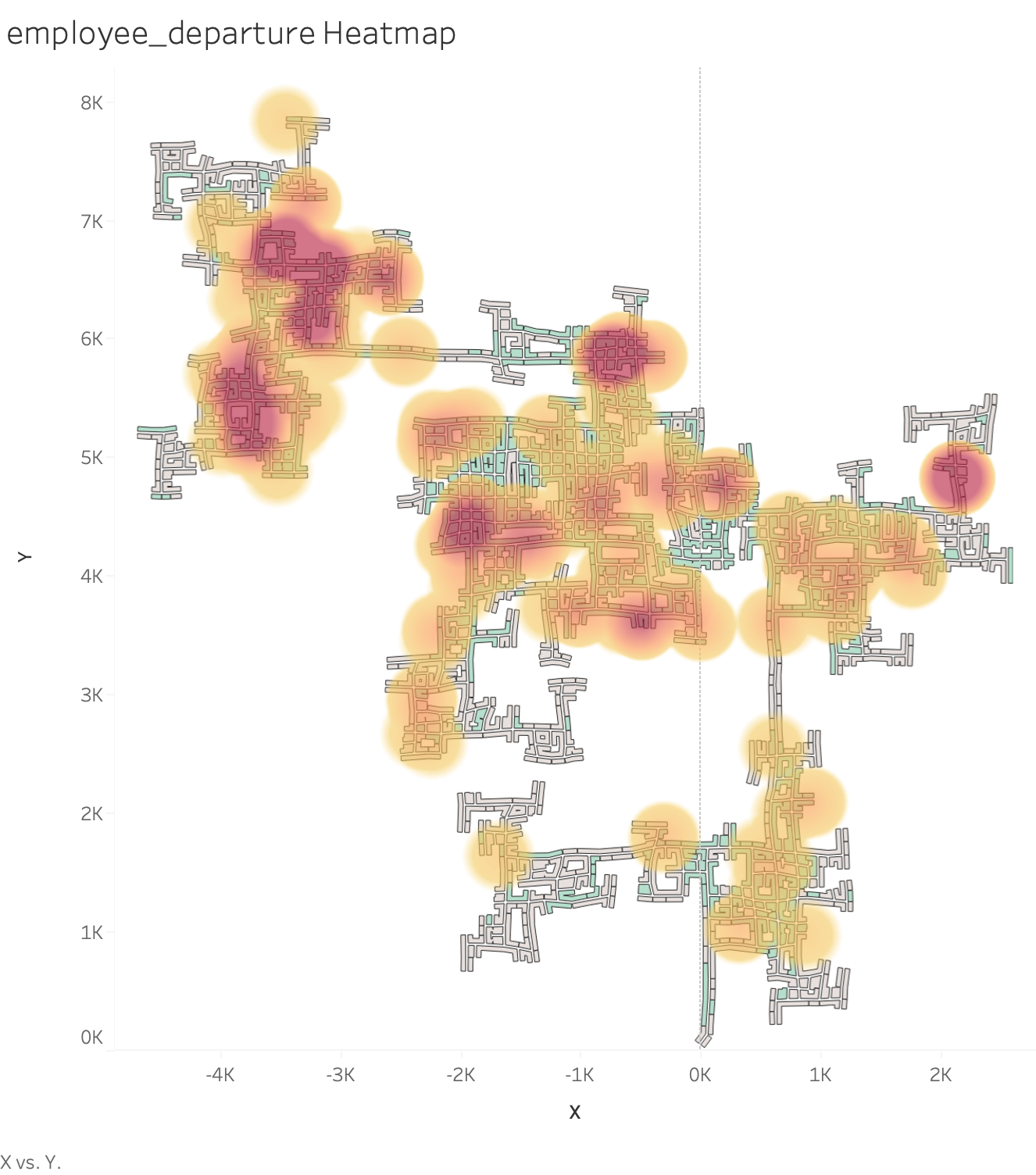
We match the map with the given coordinates and calculate the number of departure employees to form a heatmap. From this heatmap we can see that these three areas have particularly high turnover, while this place has some turnover.
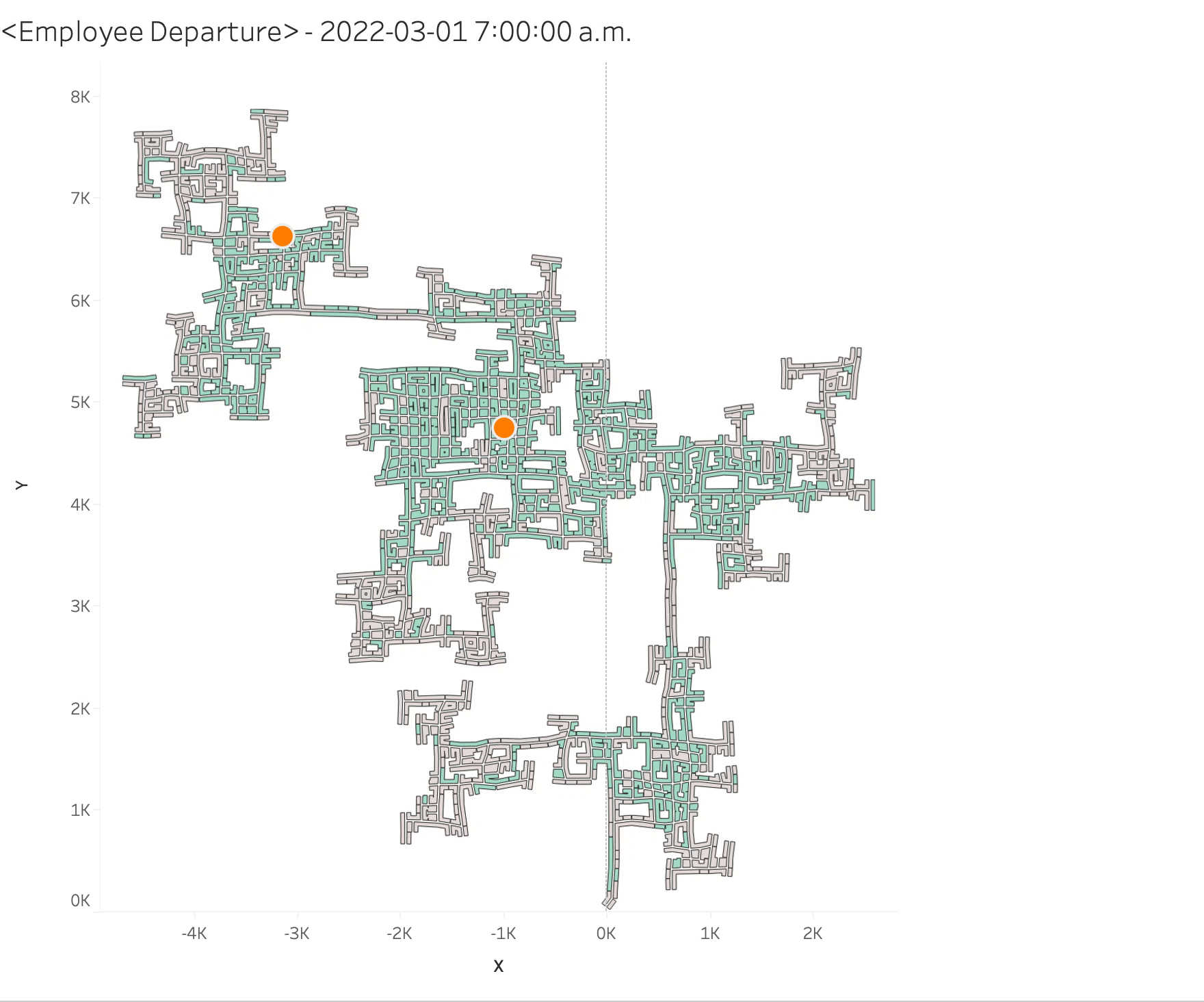
So when are these turnover happen? We here show the departure by time. The orange dot in a certain place represents the departure. This really can help get the specific time and place of departure.
